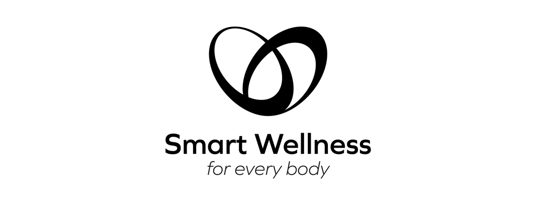
Smart Wellness Logo Design
I really appreciate all of the concepts that have been brought forward. It makes us confident that this one will be the right one for the job! Thank you.
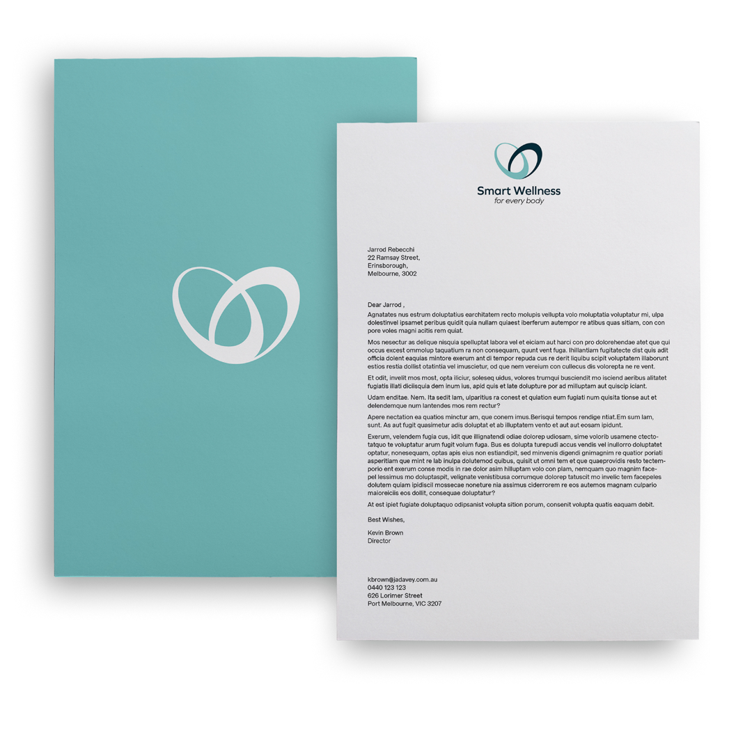
Smart Wellness Logo Design
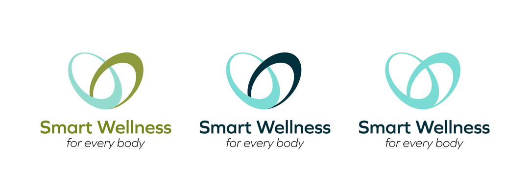
The heart is a well know and well understood symbol for both wellbeing/health and caring or kindness. It to is emotive of warmth, friendliness and helpfulness. We have used this as a key element throughout as it fits your brand and business name so perfectly and is widely recognisable and desired by your target audience.
The mark takes the shape of a heart made up of two interconnected circles/ovals representing the circle of life or cradle-to-grave idea... for every body at any stage of life. As our target audience are primarily females we wanted to have a softer looking mark. The mark looks fresh, reliable, safe, dependable and modern like your eStore.
What we did:
- New brand positioning into the marketplace
- New brand mark
 |
 |
 |
 |
 |
O